Sunday, November 14, 2010

Reading Comp_6

[[1] A common theme of the early twentieth century found in Roth, Harwood, and Massey set the tone for an understanding of styles in architecture and design influenced by fine art. Selecting either Arts + Crafts or Art Nouveau, TRACE the influences of the selected style in more than two nations. In your answer, you should include evidence from the readings and at least two annotated images as support for your analysis of influences.

            Art Nouveau is a stylistic expression in design that seeks to discard all historic precedents in order to define a new visual language never before seen.  This style is heavily influenced by post-impressionist artists like Van Gogh through the fleeting urgency and molded abstraction present in his works.  Due to the new technologies in glass and iron this dynamic disintegration could be materialized into the organic whip lash structures that characterize Art Nouveau.
This movement began in Europe and was made fashionable through France and Belgium by the works of engineers like Victor Horta who designed the iconic Hotel Eetvelde in Brussels.  The fleeting whiplash metalwork permeates the interior winter garden that dwindles throughout the hotel creating a vein-like, cohesive whole.  As Herni van de Velde so brilliantly explains it, “Nature proceeds continuity, connecting and linking together the different organs that make up a body or tree; she draws one out of the other without violence or shock.  In this way, the metalwork itself is exposed and becomes the structure and ornament, creating an indistinct, continuous flow of seamless, organic elements. 
After witnessing the winding tendrils displayed in the railings and support systems of Victor Horta's hotel, the French designer Hector Guimard emulated this feature in the entry gates of the Castel Beranger in Paris.  His work becomes even more surreal than Horta's in the way that vines engulf supporting columns and the abstracted wiring creates rhythmic lines.  This manipulation of lines became a hallmark for Art Nouveau as it turned the static geometry of lines into dynamic, contorted curves. 
            Art Nouveau also travels to Spain under the alias Art Moderno and is most iconically present in the cryptic, ‘skin and bones’ work of Antonio Gaudi.   His work features an extensive exploration of the line and the potential connections that a line has in common with the human body.  This can be clearly seen in his Casa Battlo where the interior feels like it belongs in a Tim Burton film.  The dining room is littered with creative utilization of lines in the form of undulating curves in the ceiling, biomorphic furniture, and dynamically curved windows.  Also, the specific placement of two adjacent columns closely resembles the bone structure in the legs or forearms., creating this eerie, psychedelic undertone. 
            While Art Nouveau was a short lived style soon to be replaced by the further decadence of Art Deco, it was the first style that rejected historical precedent and focused heavily on the interior.  This was in part due to the heavy influence that artists were having on designers as a new emergence of mixing art with design created a blur between structure and ornament.   

Hotel Eetvelde / Brussels, Belgium / Victor Horta (Massey, pg 35).


Castel Beranger Apartment Entry / Hector Guimard / Paris , France (Massey, pg 38).

Casa Battlo / Barcelona, Spain / Antonio Gaudi (Masey, pg 47).


[2] Originating at the Bauhaus and in the work of LeCorbusier, the so-called Modern movement deeply influenced design and architecture of the twentieth century. The great debate raised by this new approach to design involved the presence of the machine in the design process and final products. SPECULATE about the implications of “machines for living” and the famous dictum “less is more” on design today. Use at least one ARTIFACT, SPACE, or BUILDING in your answer, providing a salient image (cited) and annotation to help bolster your argument.


            The modern movement, more commonly known as the International Style came about as a reaction to the clutter of eclectic, hand-crafted homes and the inefficient molding of space through barricading walls and cramped interiors.  The new fashion became one of volume over mass, implicated by the technology of the machine in its fast inexpensive production of flexible materials.  The concept of ‘less is more’ is derived from the implication that flexible, weightless material generates an ‘opening up’ of space while that material itself becomes reduced only to it functional necessity; hence less material equals more space.  Furthermore, the functionality inherent in the machine became a tool for modeling as structures and homes were adapting to fully meet the intrinsic utilitarian needs for this efficient, modern generation.  As Walter Gropius so delicately claims,

“The nature of an object is determined by what is does.  Before a container, a chair, or a house can function properly its nature must first be studied, for it must perfectly serve its purpose; in other words, it must fulfill its function practically, must be cheap, durable, and beautiful”.  (Roth, pg 524).

The machine itself became a concept for modeling seen most readily in the works of Le Corbusier and his Villa Savoye that is, in part, based off of a 1947 automobile.  The home features elements that were made possible only by the exploitations of the machine as the lower level contains no traditional supporting walls but rather sits on illusionary stilts.  Also, the home features ribbon windows for illumination, an open floor plan with meandering ramps, and a flat roof utilized as a garden terrace that maximizes the use of space.  In every aspect, Le Corbusier strived to maximize the potential of space and the functional use of that space, making his structures a machine for a functional lifestyle whose beauty came from the joinery of an adaptable environment with that of the comfortable ease brought about from the machine.

Villa Savoye, Le Corbusier, (Roth, pg 531).


[3] From the assigned pages in Roth, Harwood, and Massey, SELECT an image that you believe explodes the notion that Modern interiors and objects were black and white. Fully RENDER your own design exploration of that image through color, material, and light and appropriately annotate and cite the image to prove this point.

Tugendhat House Dining Room, (Massey, pg 78).



Wednesday, November 10, 2010

Reflections Summary

Mears, corry  http://www.corrymears.blogspot.com

McDonagh, kayla  www.kaylammcdonagh.blogspot.com

Salgado, daniel  http://danielsalgado-daniel.blogspot.com/

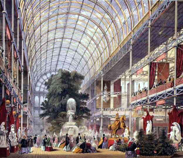
     Each of these Point commentaries seem to focus on the effect that the Crystal Palace had on the reflections unit in terms of materials, the industry, and the eclectic assortment of artifacts displayed within it.  However, I feel that Daniel is most successful in his understanding because he chose to focus almost exclusively on the Crystal palace and merge all the major points within the unit in this one structure, which I feel provides a simplistic, concentrated, and easy to read overview.  He makes a very valid point about the Crystal palace representing an 'Everything Goes" approach to design as it was a modern container holding a vessel of hodge-podge assortments.  
     On the other hand, Kayla offers a dynamic overview that touches on an array of structures, which I believe provides a more holistic experience in design but is also very general compared to the more intimate experience I received with Daniel's post.  Also, while she offers context, I believe her image could have been more original and have a deeper interpretive meaning.
     Corry falls into much the same predicament as Kayla, offering a general, easy to follow understanding of this unit but there are instances that can be quite confusing.  For example, he starts on a tangent about defining Baroque but then describes structures that are fairly unrelated to his original point.  Also the image could have been more creative in interpreting his understanding of the unit.  
     After analyzing these commentaries, I have a greater appreciation for the ability to simplistically articulate a viewpoint but at the same time there is a great need to be cautious about how the compositional layout is conducted to create a cohesive balance between simplicity and the viewer's understanding.


http://www.flatrock.org.nz/topics/history/assets/crystal_palace.jpg


http://www.istockphoto.com/file_thumbview_approve/196709/2/istockphoto_196709-clock-on-wall-01a.jpg


Alternatives Summary

Bradfield, cassandra http://cassandrashannon.blogspot.com/

Hankus, alyssa http://ahankushistoryandtheoryblog.blogspot.com/

Canipe, leslie http://lesliekcanipe.blogspot.com/

     I think it is very interesting how people choose to supply evidence to support their thoughts.  In the case of Cassie, we both have similar theatrical and documentary type writing styles.  I enjoy her careful word placement to create a vivid storyline and her supporting credits mainly derived from Roth.  On the other hand, Leslie has a strong use of visual evidence to support the structure of her thoughts while her writing mainly generalizes the overall style period she is describing so that she offers context with evidence.  Alyssa prefers to talk about analogies brought up in class, which is really useful when you are trying to connect the experiences of the past with our own experiences.  For example, she mentioned the connection between Patrick's kart wheels with that of a continues cycle of periods of great change and stagnant repercussions.  While each person had a different way of supporting their understandings I would like to have seen more examples from the architecture we have discussed in class with specific ties to many of the general assumptions made within these commentaries.   With so many 'alternatives' to supporting evidence, I feel like I have learned of new ways beyond my style to provoke a certain experience and better help other understand my own thoughts.


http://www.w1style.co.uk/details.asp?productid=3615


http://www.bloggersbase.com/travel/roam-in-ancient-vibrant-city-rome/


Sunday, November 7, 2010

Point_4: Reflections


            The reflections unit explores the design history between the Renaissance and the style we coin Modernism beginning in the early 20th century.  This period is heavily defined by an eclectic assimilation of designs from all over the world an in all manners of time.  There is an obsession with revolutions in design styles that occur so rapidly and simultaneously that no one seems comfortable or satisfied enough to keep with one taste.  Once again, we see the assimilation of antiquity but in drastic deformation according to Baroque and strict mimicry according to Neoclassical.  Influences from the east through trade bring a curiosity for foreign materials that spark an eclectic surface decoration called Chinoiserie.  The rise of the industry further sparks our insatiable interest in pushing design to new heights through the rise of mass production and new materials.  Design has become less concerned with good taste and more intrigued by the potential of materials and the means of production in order to create all forms of design.  Where once production of design was carried out by the noble and the rising gentry now there is an open debate by those in the middle-class, opening up the avenues of taste and making design a matter of conversation that concerns everyone with an opinion.
            Throughout history, there have been many revivals of cultural design styles but now the world is more closely unified through trade and a universal economy that all methods of design are available to the dominating economic countries.  These countries like England, France, and Italy have an abundance of raw materials and the knowledge of other cultures design history so that they easily merge these aspects into their own society, creating a widespread assimilation of cultures never before seen.  This is most clearly defined in the Royal Pavilion at Brighton, England where the exterior’s looming minarets are reminiscent of Islamic and Indian cultures while the interior houses the most elaborate Chinoiserie surface decoration in all of the British Isles obviously inspired by goods arriving from the east through the silk road and other major trade routes.  Another example concerns a whole stylistic period termed as the Victorian style that is widely acclaimed for it’s hodge-podge of design elements and it’s heavily cluttered interiors that feature an array of artifacts with dissimilar attributes.  One such example is at Strawberry Hill that utilizes features in all manners of Gothic revival from the old English Gothic technique of fan vaulting to the later Tudor style tracery patterns. 
            The assimilation of other cultures design history is in much gratitude to the development of trade routes that is, in turn, in gratitude to the emergence of industries.
As population growths in cities continued to rise there was reluctance in the continuation of low producing craftsmen and a shift to the industries that used machines as a mode of fast production.  The industry was a supplier of materials like iron and glass that propelled a design revolution in the mid 19th century.  These new materials began questioning our knowledge of design and structure that led people on a quest to discover what is modern, to find a singular style that dominated the mediocre assimilated styles of the previous generation.  The first models of this new generation began in structures like greenhouses, with its extensive use of glass and metal framing, it became the prototype for greater structures like the Crystal Palace exhibition hall that ironically displayed the assimilated design pieces of the previous age.  This new age preferred volume over mass and simplicity over ornament.  Even designers like William Morris who were critics of the machine realized the importance of returning to a singular style to create a balance in taste, although he promoted the handcraft alternative and creating art for arts sake. This can be clearly seen through his home, the Red House, that turns back to the simplistic Gothic roots of England with little other design influences so as not to interfere with the singular tone set into play.  As the mass assimilation dwindles mass production continues to thrive but the debate lingers on and widens as designers ultimately begin questioning whether handcraft or machine should be the dominant proponent of products.  This question still endures to the current.


Ironically, the fog of this image clearly represents the history uncovered in the Reflections unit through the murky assimilation of design from all sorts of locations and cultures.  The fog acts as a screen, blending all matters of good taste into an unsightly whole.  Yet in the midst of this blended chaos, there is the dominance of the industry in the background, never letting go of its influence on design.   

Sunday, October 31, 2010

Reading Comprehension 5

[1] From the Roth, Harwood, and Massey readings, select an ARTIFACT you believe to represent revolution in design. SPECULATE about the type of revolution this artifact symbolizes. Supplement your answer with a beautifully hand rendered image of the artifact you selected, citing source and page on your image. [10 POINTS POSSIBLE]


     This is an Argand lamp invented in 1781 using a tubular wick fueled by an oil reservoir.  As one of the first artificial lighting sources, it greatly influenced and revolutionized the illumination of interior spaces, which allowed less focus on natural light and the strict, spatial planning revolving around natural light.   As one of the first prototypes of artificial lighting, it has its downsides with the bulky oil resevoir that emits unsightly silhouettes where clean light would otherwise cast and so later designs used this lamp as a model with slight updates.  The portability of oil lamps allows for more flexibility in use while also providing the opportunity to illuminate many different spaces as opposed to fixed lighting like chandeliers.  The most common source of artificial light prior to oil lamps were candles but they didn’t offer anywhere near the amount of illumination of the Argand lamp.  The industrial revolution supplied the technology through fast production and material inventiveness that made it possible to create oil lamps that in turn revolutionized the way we experience and respond to interior space.

Harwood, Architecture and Interior Design from the 19th century, pg 23.

[2] Using the internet, LOCATE and ANALYZE an image for an ARTIFACT, a SPACE, a BUILDING, and a PLACE, drawing the idea of eastern influences as understood by nineteenth-century minds (China, Japan, India, Middle Eastern) on western design and architecture. Each answer must include an appropriately annotated and cited image in addition to a well-crafted essay to defend your choice of each image and the ways (more than one) that the material item responds to design influences from the east. [20 POINTS POSSIBLE]**


     The west was most readily influenced by the east through newly, extensive trade routes that linked the two worlds together.  The inception of precious materials such as silk and porcelain as well as design characteristics like laquered wood and design concepts such as asymmetry and harmony with nature led to a design style coined as Chinoiserie by the French.  In a rapidly growing commercial industry, desires and curiosity for exotic goods grew as previous western designs became boring and mundane.


Irish Chinese, Chippendale Mahogany Cabinet

     The famous wood craftsman, Thomas Chippendale created this mahogany cabinet as a marriage between English, classical eclecticism with that of simple Chinoiserie surface decoration.  The cabinet was inspired by the East through the delicate fretwork placed below the protruding, lower shelf and the visually fragile wood paneling displayed on the bookshelf.  Clearly influenced by the East, the cabinet still maintains classical simplicity through the iconic cornice molding and the strictly established symmetry.  The English had a distinct infatuation with rational simplicity that coincides with their perception of the ‘down-to-earth’ nature of Eastern lifestyles, so that by incorporating design features celebrated in the East, they too could tap into that harmony.


Château de Chantilly interior, France 

     The French particularly took an interest in Chinoiserie because it complimented and accentuated their own Rococo style.  Here at the Chateau de Chantilly the owners collaborated the pictorial, landscape scenes reflecting the mystery and carefree nature of how they perceived China with that of the heavily gilded wood panels of the Rococo panache.  Furthermore, the lacquered surface decoration littered throughout the space is reminiscent of the delicate wood craftsmanship commonly seen in eastern design.  This space is the perfect embodiment between the original French interior style of Rococo with the western version of Chinese surface decoration.  


China House, Potsdam Germany (Garden Pavilion).

     The China House in Germany is a further exploration of the perceived care-free nature of the Chinese mostly as a reflection of the German aristocracies attraction to decadence and novelty expressed through an exotic culture.  This western imitation structure is by no surprise a garden pavilion reflecting the East’s strong affinity with nature and seclusion.  Four sandstone columns support the porch with massive floral capitals imitating eastern design permeated by gilded figurines in eastern apparel.   The top is crowned with a Chinese cupola with yet another eastern figurine perched comfortably in the center.  Even the light color palette in a shade of green reflects the influence of the East with attempts to blend in to the environment.   The building functions as a small lodge for social gathering of the noble, reflecting the informal attitude of western perception towards the east.  


Kew Gardens, London

     Kew Gardens within London displays a small Japanese landscape shown here with a Pagoda tower and a small, undulated pavilion dotting a flourishing, meandering landscape.  The whimsical pathways reflect the asymmetrical, ‘go with the flow’ persona of the east but also the clear respect for nature with careful placement of structures that don’t dominate the environment.  These intricate, weaving pathways were a reaction to the formal, sweeping lines of other contemporaries as the English preferred to fantasize every now and again in the secluded parks of the otherwise urban London or before returning to their rationally classical homes.   


Thursday, October 28, 2010

Counter Point: Perspective


This unit focused on Gothic, the Renaissance, and the early Baroque stylistic periods and as such I chose the word extention, WITH A T....to reflect on the extension through verticality of the Gothic style and the continuation of classical design that echoes throughout the Renaissance.  The theme was perspective, so I chose to create a simple one-point perspective backdrop with the word 'extending' back into space.  Furthermore, perspective as we know it was invented in the Renaissance so it made sense to me to draw La Rotunda following the same vanishing point as the word.  I rendered with a base coat of chartpak marker highlighted mostly with staedler pencils and light areas of colored pencil.

Counter Point: Compass


I chose to talk about the Roman Forums as a place in history that guided the rest of the world as far as design technique as well as how the building form itself is a reflection of the Roman spirit in an artificial nature.  I used a combination of techniques in photoshop such as auto levels, opacity, and layers to create the picturesque format seen above.