Sunday, October 31, 2010

Reading Comprehension 5

[1] From the Roth, Harwood, and Massey readings, select an ARTIFACT you believe to represent revolution in design. SPECULATE about the type of revolution this artifact symbolizes. Supplement your answer with a beautifully hand rendered image of the artifact you selected, citing source and page on your image. [10 POINTS POSSIBLE]


     This is an Argand lamp invented in 1781 using a tubular wick fueled by an oil reservoir.  As one of the first artificial lighting sources, it greatly influenced and revolutionized the illumination of interior spaces, which allowed less focus on natural light and the strict, spatial planning revolving around natural light.   As one of the first prototypes of artificial lighting, it has its downsides with the bulky oil resevoir that emits unsightly silhouettes where clean light would otherwise cast and so later designs used this lamp as a model with slight updates.  The portability of oil lamps allows for more flexibility in use while also providing the opportunity to illuminate many different spaces as opposed to fixed lighting like chandeliers.  The most common source of artificial light prior to oil lamps were candles but they didn’t offer anywhere near the amount of illumination of the Argand lamp.  The industrial revolution supplied the technology through fast production and material inventiveness that made it possible to create oil lamps that in turn revolutionized the way we experience and respond to interior space.

Harwood, Architecture and Interior Design from the 19th century, pg 23.

[2] Using the internet, LOCATE and ANALYZE an image for an ARTIFACT, a SPACE, a BUILDING, and a PLACE, drawing the idea of eastern influences as understood by nineteenth-century minds (China, Japan, India, Middle Eastern) on western design and architecture. Each answer must include an appropriately annotated and cited image in addition to a well-crafted essay to defend your choice of each image and the ways (more than one) that the material item responds to design influences from the east. [20 POINTS POSSIBLE]**


     The west was most readily influenced by the east through newly, extensive trade routes that linked the two worlds together.  The inception of precious materials such as silk and porcelain as well as design characteristics like laquered wood and design concepts such as asymmetry and harmony with nature led to a design style coined as Chinoiserie by the French.  In a rapidly growing commercial industry, desires and curiosity for exotic goods grew as previous western designs became boring and mundane.


Irish Chinese, Chippendale Mahogany Cabinet

     The famous wood craftsman, Thomas Chippendale created this mahogany cabinet as a marriage between English, classical eclecticism with that of simple Chinoiserie surface decoration.  The cabinet was inspired by the East through the delicate fretwork placed below the protruding, lower shelf and the visually fragile wood paneling displayed on the bookshelf.  Clearly influenced by the East, the cabinet still maintains classical simplicity through the iconic cornice molding and the strictly established symmetry.  The English had a distinct infatuation with rational simplicity that coincides with their perception of the ‘down-to-earth’ nature of Eastern lifestyles, so that by incorporating design features celebrated in the East, they too could tap into that harmony.


Château de Chantilly interior, France 

     The French particularly took an interest in Chinoiserie because it complimented and accentuated their own Rococo style.  Here at the Chateau de Chantilly the owners collaborated the pictorial, landscape scenes reflecting the mystery and carefree nature of how they perceived China with that of the heavily gilded wood panels of the Rococo panache.  Furthermore, the lacquered surface decoration littered throughout the space is reminiscent of the delicate wood craftsmanship commonly seen in eastern design.  This space is the perfect embodiment between the original French interior style of Rococo with the western version of Chinese surface decoration.  


China House, Potsdam Germany (Garden Pavilion).

     The China House in Germany is a further exploration of the perceived care-free nature of the Chinese mostly as a reflection of the German aristocracies attraction to decadence and novelty expressed through an exotic culture.  This western imitation structure is by no surprise a garden pavilion reflecting the East’s strong affinity with nature and seclusion.  Four sandstone columns support the porch with massive floral capitals imitating eastern design permeated by gilded figurines in eastern apparel.   The top is crowned with a Chinese cupola with yet another eastern figurine perched comfortably in the center.  Even the light color palette in a shade of green reflects the influence of the East with attempts to blend in to the environment.   The building functions as a small lodge for social gathering of the noble, reflecting the informal attitude of western perception towards the east.  


Kew Gardens, London

     Kew Gardens within London displays a small Japanese landscape shown here with a Pagoda tower and a small, undulated pavilion dotting a flourishing, meandering landscape.  The whimsical pathways reflect the asymmetrical, ‘go with the flow’ persona of the east but also the clear respect for nature with careful placement of structures that don’t dominate the environment.  These intricate, weaving pathways were a reaction to the formal, sweeping lines of other contemporaries as the English preferred to fantasize every now and again in the secluded parks of the otherwise urban London or before returning to their rationally classical homes.   


Thursday, October 28, 2010

Counter Point: Perspective


This unit focused on Gothic, the Renaissance, and the early Baroque stylistic periods and as such I chose the word extention, WITH A T....to reflect on the extension through verticality of the Gothic style and the continuation of classical design that echoes throughout the Renaissance.  The theme was perspective, so I chose to create a simple one-point perspective backdrop with the word 'extending' back into space.  Furthermore, perspective as we know it was invented in the Renaissance so it made sense to me to draw La Rotunda following the same vanishing point as the word.  I rendered with a base coat of chartpak marker highlighted mostly with staedler pencils and light areas of colored pencil.

Counter Point: Compass


I chose to talk about the Roman Forums as a place in history that guided the rest of the world as far as design technique as well as how the building form itself is a reflection of the Roman spirit in an artificial nature.  I used a combination of techniques in photoshop such as auto levels, opacity, and layers to create the picturesque format seen above.

Sunday, October 24, 2010

Point_3

The alternatives unit brings about a wonderful complexity in architecture and design as more and more opinions become relevant and voiced, creating a labyrinth out of what used to be a cohesive design language in antiquity.  Instead, there are a series of transitional design revolutions that seek to both emulate and deviate from antiquity.  However, a common concept remains in each design phase, and that is a test to the boundaries that create limitations.  We see this blatantly expressed in the formal verticality of Gothic, the classically based yet more intricate Renaissance, and most of all in the ostentatious, fluidity of both Baroque and Rococo.  Where the world was once narrow and confined to isolated geographical locations like Egypt and Greece or was dominated by Imperial Rome, there is now a natural fluidity in debate and design concepts that led to greater expression. 
            In a time of constant threat and uncertainty, the Gothic style emerged as a heavenly beacon in an otherwise desolate and obsolete existence, promoted by the rising authority of the church.  This ideology and lifestyle is much distanced from the stability of the once Roman empire that focused on material pleasures and public entertainment.  Life was much more spiritual, and therefore a new type of design was to be implemented, one that would break the boundaries of vertical space and manipulate light as an architectural element at a unprecedented intensity.  The Gothic style was itself a revolution initiated in the way people considered the earthly world to be mundane and the church reacted by creating a architectural revolution based on a heaven bound focal point.  Once one Gothic church was erected, several began springing up around Europe, each providing their own contribution built off the previous model yet all connected by a common goal; to link man and heaven through illumination representing the divine.  The style was a test of faith and accomplishment of a community, church clergy, and numerous craftsmen, not a sole mastermind, and therefore many voices were expressed, which can be seen in the variation of architectural elements, the structural reinforcements, and the sheer time it took to complete a Gothic cathedral. 
            On the other hand, the Renaissance took a much different approach to design returning to the classical rationalism and balance of elements seen in Greek and Roman architecture.  While the architecture of this time seems to mimic classical antiquity with a lack of originality, the people of this time pushed the boundaries of limitations through a mindset of human potential and confidence in intellectual capacity rather than spiritual fervor.  They started this transitional revolution by reflecting back on the rational proportions of the classics because it was grounded in the same ideology of scientific logic that the Renaissance adopted and perfected for their own benefit.  A good example is the invention of Brunelleschi’s dome for the Duomo, where the model was inspired from the classical Pantheon but was recalculated to a more egg-like shell to benefit the nature of the structure.  Another aspect that should not be overlooked is the finances that made these structures possible.  Patrons of wealthy middle class merchants and bankers as well as the dictating church and collection of plebian guilds all aided in the design language of this time.  There were many voices yearning to be heard, and thus there were many different appearances to an overall social theme of harmonious balance represented through clear boundaries.  Ironically, it seems that the Renaissance chose to push the boundaries of human potential by creating elaborate boundaries to bring about a sense of unity and separation of parts.   For example, looking at the intricate patterning of the front façade of Santa Maria Novella there is a clear unity through repetition of patterns yet also a separation of parts through contrast and geometric boundaries.    
            The following design revolution of the fluid Baroque style energizes the rather boring mimicry of the Renaissance by representing a dynamic flow of space with otherwise stagnant materials.  Baroque broke the boundaries of our sensory experience because it is a highly interactive style that Roth would state as being, “grasped through one’s experiencing it in its variety of effects”.  Whole cities were treated as if they were theatrical stages spilling forth to inspire and move us.  Examples range from the highly fluid space containing the ecstasy of Saint Teresa to the illusionary painted ceiling of the Sistine Chapel, to the protruding and receding façade of Sant Andrea al Quirnale.  This style was not just a test of boundaries but a sheer lack of boundaries given up to fully express human ingenuity.  Once again, many opinions were being voiced through the variety of patrons but now the artists and designers too are expressing their own individuality through a compromise in patron desire and artistic creativeness.  


This image clearly depicts the struggles of the alternatives unit to break free from the oppressive restrictions of our limited understanding of the world and the capacity to overcome boundaries that hold us back.  It is human nature never to be content with the here and now but in the curiosity of the possible, of the dream, of the potential that has not yet been reached.  Each design revolution brings about a temporary satisfaction until our restlessness sets in and once again we struggle to break the boundaries of the previous generation.  

Monday, October 18, 2010

Reading Composition 4


[1] Just as we learned with Gothic cathedrals, in the context of each PLACE, the other scales of analysis (ARTIFACT, SPACE, and BUILDING) each demonstrate difference. For each scale on the readings rubric above, EXPLAIN at least one common design language that links them all. Use the principles and elements of design as defined for this class in your response. Explicitly tie the Roth reading to your analysis, using at least one cited quote.

A common design language linking all of the above locations is a grounded belief in an architecture that is established from classical antiquity. Their responses to architecture relate to a rational but also flexible technique to classicism. Roth pinpoints the styles of these locations as being eclectic, “the informed and selective borrowing of historical building forms and details’.  This eclectic pining of antiquity led to an overall design theme based on simplistic geometry set in a symmetrical balance with distinct boundaries.  This formal sophistication of geometric patterns was heavily emphasized in the American Georgian style.  While all of these places exhibit separate techniques they all remain grounded in the emulation of classical design;
The buildings also share a common design language based in classical antiquity and more recently, the Renaissance.  While all of them share the classical transitioning structure of the portico aside from the Nathaniel-Russell House a common theme among all is repetition of simple elements whether it is the symmetrically placed and evenly spaced windows of the façade or the stringcourses that delineate the interior floors.  Moreover, all of the structures have a sense of calmness because they are not heavily ornate with stucco and sculpture but rather emphasize simple geometric proportions while the repetition of design elements brings a sort of expected tranquility.  As Roth states, “The deceptive ornament of Baroque had to be stripped away, architecture had to get back to essentials”.
      Once the skeleton is removed, the interiors speak the same design language but become slightly more ornate through intricate and repetitive patterns usually with an emphasis on geometric patterns.  The interiors become a focal point for more complex textures that contrast the simple geometry of the exteriors but at the same time these intricate patterns seem to follow a sense of proportional scale.  For example, these interiors begin their patterns on area rugs that then move to floor molding or wallpaper textures, that then move to ceiling molding.  All the while, these patterns are represented at different scales and offer a transitional balance throughout the space so that the eye is constantly reassured by the repetition of the same elements only changing in scale and materiality. 
            The artifacts of these periods are the most ornate designs because they, over all the other scales, display an intimacy of craft and taste that reflect on the owner, while also beings the closest scale to humans.  There is an obvious sense of parts related to a whole, or unity, within these objects.  For example, the tall clock has a base, a shaft, and a capital where the clock sits that is very representational of a column; the other artifacts follow a similar pattern of parts to a whole.  Furthermore, there is a heavy sense of ornamental placement value within strict boundaries.  For example, the bookcase with chinisorie contains compartmentalized panels with floral pictorials while the Sheraton chair is firmly symmetrical with a central ornamental detail of an urn.  

Citation:
            -Harwood pg. 404-526
            -History and Theory of Design II, Class Notes, 9/13/10, Design Elements and Principles.


[2] Linked to Europe, the ARTIFACTS, SPACES, BUILDINGS, and PLACES of the American colonies echo closely their design forebears. Selecting evidence from all four scales for both the American Georgian periods, TRACE the common design ancestry across the Atlantic Ocean in the Neo-Palladian and Late Georgian periods of England and the Louis XVI/French Provincial period in France. ARTICULATE the implications of copying from Europe for the American colonies. Use the principles and elements of design as defined for this class in your response. Explicitly tie the Roth reading to your analysis, using at least one cited quote. [10 points possible]

            The colonial English architecture began in the growing cities of New England such as the port city of Boston in a strictly vernacular sense as materials were limited and most labor was focused on basic survival through primitive, rational structures.  Roth refers to this ‘primitive design’ as, “the art of pure structure, serving original functions and not applied as ornament”.  Early dwellings in colonial America focused on medieval techniques of construction and therefore were modest in scale and emphasized honesty in structural material.  The Parson Capen House is a prime example echoing English medieval technique through high pitched framing, strictly utilized wood material, and a central chimney.  The interiors, like that of the Hart House, represent an even harsher eclectic assimilation of the English medieval past through a reminiscent low beamed, wooden ceiling and bland interior ornament.  However, nothing better represents the rigorous functionality of this medieval vernacular than the gateleg table that initially can serve as a small side table, which folds out into a circular table used for dining, very useful for the multi-functional rooms seen in colonial infrastructure.  Ironically, while colonial settlers in America were going through there own medieval dark age based on English archetypes, England was focused on reviving classicism based on Palladian models.
            While English colonists settle on the upper east coast of North America, the Spaniards find their niche on the southern tip of Florida at St. Augustine and onward into the southwestern territories.  The Spanish, unlike other pilgrims, adopted the vernacular of the indigenous people, leaving only high-style structures like Cathedrals as monuments to Renaissance and Baroque models in Spain.  The Governor’s Palace in New Mexico is a clear representation of indigenous influence using adobe construction methods but at the same time reflects monumental, Spanish scale through a stretched horizontal structure, which offers contrast through the materiality of adobe and repetitive wooden beams.  On the other hand lies the interior of the Columbus House, which represents a direct Spanish Renaissance influence through the symmetrical arch entries with wrought iron grilles and intricate, geometric tiles.  Perhaps the best example of a merge between Spain and the indigenous is represented through the Frailero, a chair that is simplified from its original Spanish version.  It offers contrast in ornamental elements, the horizontal features displaying the dynamic, twisted embellishment that echoes Spanish Baroque, while the vertical features display the structural integrity and use of honest materials of the indigenous people.  Spanish colonial architecture remains quite rudimentary compared to the design concepts spreading throughout Europe and the highly ornate Baroque fashion crave in Spain but while Europe has had established nations for centuries, the colonies are just beginning their history.
            As one of the three great nations of the 17th century, naturally France played its role in the colonization of the New World, lining the Mississippi River that culminated in the city of New Orleans.  The French remained somewhat isolated in their architectural design first basing their structures off medieval, vernacular archetypes from France and then creating revisions due to climate variations with their most sophisticated, high style structures located in New Orleans.  The Houssaye House replicates French design through a steep, gable roof, French doors, and a spacious porch that extends the home outside with that of changes made from climate variations through a hollow first level.  This creates a unique balance between French elegance and climatic functionalism.  The Parlagne Plantation completes much the same function by marrying the rural, Creole style on the exterior with the refined, elegance of France in the interior through asymmetrical spatial arrangements.  Furthermore, the colonial French armoires have a simplistic elegance borrowed directly from the provincial style in France with simple wood molding, a curving base, and large double doors; each part unifyed to a simplistic whole.  Like English colonist, the French pilgrims related their structures back to their vernacular, medieval past but with a greater sense of intricacy and elegance.  
            The Germans and Dutch too left their small imprint on colonial America settling in areas of New England, such as New York, and then drifting down the eastern coast much like the English settlers.  Because of the coincidence, German colonists merged with English design and exerted minimal, original influence except in isolated areas; they are most known for their log houses.  The single brother’s house in Old Salem represents a more sophisticated, urban style of German design mixing timber construction with a balance of mixed brick tones and double roofing.  On the other hand, the bland interior of the Andrew Jackson log house represents the typical vernacular style and functional integrity of homes located in the western expansion.  The interior contains a single, multi-functional room and the artifacts as well respond to this need for function through a trundle bed that can be folded in or out for spatial and functional requirements.  German artifacts like the shrank balance subtle decoration with utilitarian needs and also provide a sense of contrast through open and closed arrangements; the bottom offering privacy and the top a display of dining appliances.  The simple molding and undulated, wood carvings provide an aesthetic while the levels of scale provided in the shelves presents a sense of ordered repetition.  The German and Dutch followed the same trend as all early colonist in utilizing medieval models from their homeland because they fit the initial functionalism needed to survive in a newly discovered continent.  The mother countries of Germany and Holland were focused on applying a mixture of the Palladian Renaissance style and the Late Baroque style.  
           
Citation:
            -Roth, pg 443.
            -Harwood pg. 251-321
            -History and Theory of Design II, Class Notes, 9/13/10, Design Elements and Principles.


[3] From the Hersey/Freedman reading, DESIGN and POST a labeled floor plan of a possible Palladian villa inspired by Girolamo Frescobaldi’s Balletto Terzo found online at this site: http://www.metmuseum.org/toah/hd/renm/hd_renm.htm select the link on the left side of the page with Frescobaldi’s name under multimedias [5 points possible]


Based off the Hersey/Freedman reading and the rhythmic beat of the Baletto Terzo, I developed a floor plan with a ratio of 3:4 from the main structural unit with radiating transitional spaces to the exterior from the front portico, back porch, and side verandas.  The circular center is created visually not by walls but by circular columns repeated in a circular colonnade.  The central dome is 1/3 the length of the villa expanding to the doorways on either side and is 1/3 the width of the villa if the circle is expanded through to the side verandas.  The corner rooms all follow a 1:1 ratio while the two rooms flanking the Saloon follow a 2:3 ratio.  The windows follow a symmetrical, constant beat that I based off the Baletto Terzo.  I placed the rooms in a way that I thought was logical, having the entertainment and display rooms towards the front while the utilitarian Kitchen and private Bedroom sit quietly behind closed doors.  The front rooms provide open entryways for air ventilation between both sides of the villa and allow light to illuminate the spaces.   


[4] Using the resources at the weblink below, SPECULATE about whether you believe that the architecture and design in the Baroque period stands as a form of social performance in the theatre of the world. Support your response with examples from class and the assigned readings. [5 points possible] http://fathom.lib.uchicago.edu/2/10701023/

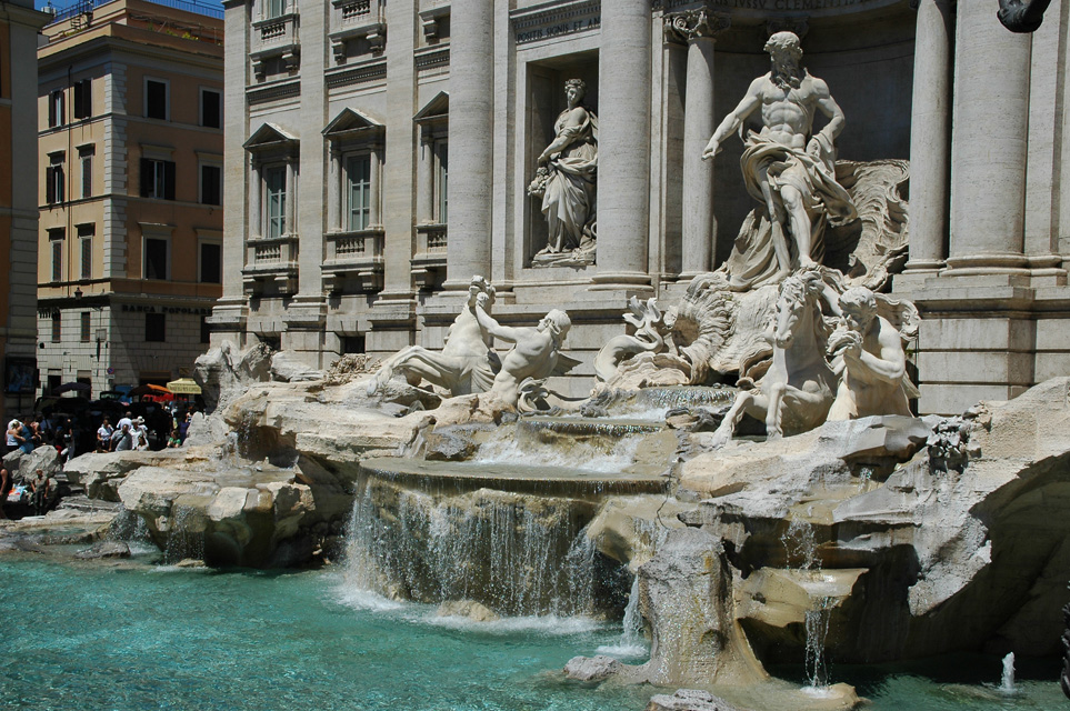
            From both previous and current art history courses I have studied and observed the terms we coin for Baroque architecture as being fluid, dynamic, monumental, warped, limit-breaking, and theatrical but never before have I realized how much the Baroque style encompasses until I read this online passage.  Baroque is more than just an architectural style, it permeates throughout sculpture, painting, theatre, music, and even literature; it was a frame of mind, a reflection of overall taste, and a lifestyle.  The Baroque lifestyle treated the whole world, particularly in cities, as a theatre.  I believe firmly that all aspects in life during the Baroque phase were treated theatrically simply because Baroque is an illusionistic style focused on the manipulation of space and the drama of movement.  A prime example of this style is Michelangelo’s painted ceiling for the Sistine Chapel.  Here, he increases the volume of the space through illusionistic, painted vaults on an otherwise flat ceiling while all of his figures are engaged in bold, dynamic poses, creating a dramatic, theatrical performance for the dwarfed public to behold.  Moreover, theatrical displays were not kept cramped indoors but were blatantly displayed on the bugling protrusions and recessions of exterior facades and optical illusions of piazzas to provide a socially intriguing engagement for pedestrians.  Perhaps there is no greater instance of this display than from what Roth shows us visually from the Piazza of Saint Peters.  The initial trapezoidal geometry of the piazzas arms make Saint Peters the focal point and give the structure a perceived increase in scale while the outer arms of the piazza extend outward in a semi circle to embrace the public into the theatrics of the city.  Most importantly, the Baroque style was one that attempted to engage the senses and emotions of every citizen and was apparent through its ominous presence throughout the cities and through multiple genres of expression; life was a stage, and every profession in society had its role. 

Citations:
-Roth, p. 408
- History and Theory of Design II , 10/15/10, Baroque


http://www.tropicalisland.de/italy/rome/trevi_fountain/images/FCO%20Rome%20-%20Trevi%20Fountain%20detail%2003%203008x2000.jpg

Tuesday, October 5, 2010

Point_2 : Foundations

In the foundations unit, we have started to delve into specific ancient cultures to analyze their effect on design throughout history up until the present.  The overall theme of this unit tells us that design is based whole-heartedly on prototypes, on rudimentary, original models that morph through many design phases until they reach the archetype, or the pinnacle of the design phase that we generally conceive of as the climax of any cultures mark in history.  For example, the distinguishing of Egypt into three separate ages, The Old, Middle, and New Kingdoms reflects the productivity and innovation of that cultures design phase. While in the last unit, I realized that design was based on the conceptual integrity of people as much as it was about the end product; this unit taught me that design is not without a sense of emulation for the past, because no design goes untouched by the prototypes that preceded it.
As one of the oldest and still significantly intact cultures of the ancient world, Egypt stands as a monument of timeless design coinciding with its rather stagnant, dry climate, isolated borders, and the continuous flooding cycle of the Nile.  One of the earliest prototype models for Egypt was the bench-shaped architectural form known as a mastaba that served as a tomb and reflects on the reverent Egyptian belief in an afterlife.  The mastaba was later morphed through several transitional, design phases starting with the step pyramid of Dosjer that used the mastaba form and stacked three more layers of mastabas on top of one another in declining size to the final and famous pyramids of Giza that are smooth with articulated corners pointing to the assumed four corners of the Earth.  Each prototype served a function and promoted the process to a more refined model, exactly the way we as designers function. 
Another theme that should not be overlooked is the power that geography has over the perception of a cultures ideology and design language.  Perhaps no other culture best exemplifies this notion than Greece.  As Roth examines, Greece’s mainland has a rocky, mountainous terrain that quickly turns their attention to the adventurous sea for a living.  This rough existence transformed the Greeks into a people of explorers and logical thinkers finding comfort in the ideal form rather that realistic.  Like all cultures, Greece still could not escape the inevitable formation of prototypes and one of their earliest models was the megaron.  The megaron began as a three sided structure with a central row of columns all created from wood and then through progressing transitions they created the architectural orders that led to the classical temple form we see today epitomized in the Parthenon.  The nature of Greek temples created a transitional space from exterior to interior supported by the ‘opening up’ of space due to the columns.  This articulated space created different sensory environments starting at the porch or portico, followed shortly after by the large interior space or court, and lastly to the hearth or focal point.  In part, this rational and intimate design led the Greeks to transform the temple prototype into an archetype that was copied to other temples and secular structures like stoas and agoras. 
  Rome was a culture unlike any other by the fact that their culture is not named after the country, Italy, in which it resides but rather the city that houses the majority of public, civilized life.  This information alone, tells us that Roman culture was focused on the public and that their architecture was designed to respond to the needs and comforts of the public.  Rome accomplished this by using prototypes based from Greek architectural orders to engineer a wide array of public structures never seen before, ranging from public baths to amphitheatres.  The pragmatic prowess and functional focus of Rome offers steep contrast to the idealistically ordered Greeks.  The vast extravagancy through volume and embellishment as well as the entertainment through free bread and circus of this culture reflects a very modern attitude and can account for our particular interest in their designs.  Rome was a culture of invention sparked by a past filled with fighting and conquest to get what they deserved and therefore they created numerous prototypes for their new structures based on new techniques and materials.  However, they are best known for their archetype structures that served as models not just within Rome, but throughout their vast empire and still continue to influence modern design perhaps over that of any other culture.  Furthermore, they created many hybrid structures meant to resemble the Greek architectural orders with very different structural techniques.


This image is the epitome of my understanding and representation of the foundations unit.  Essentially, all structures and designs begin with simpler and smaller building blocks tested and built on one another.  These progressive attempts are known as the prototypes and correspond to the design phases of each particular culture that eventually culminate in the final and copied archetype.  Analyzing this image, design is as much about looking to the past for models that withstood the test of time as it is about the final glory of the archetype.  For example, if one walks into a gallery and admires the end product they lose half the experience by not studying the process.  Without the knowledge of prototypes there could be no archetypes. 

Friday, October 1, 2010

Reading Comprehension 3


[1] Compare and contrast the cathedrals according to the matrix. To illustrate your post, hand draw a view of your “main” cathedral, scan it and place it at the top of your response. Your written thoughts should fully illuminate the questions asked with each cathedral pairing on the website. Strive for 250- 300 words total for this response. Include additional images, as applicable, if you wish. Also check out the west vs. east page and digest what is written there (20 points).
Cologne Cathedral


Cologne/Salisbury
Inside/Outside

The Cologne Cathedral in Germany and Salisbury Cathedral in England have very similar interiors visually and this is mainly because the people in these regions had basically the same function and purpose for the structure, the only separations are a few taste differences.  Both are derived from the basilica prototype structure in Rome because the long nave suits the function of the initiation process, of the strife it takes to keep the religious faith, and mimics the long journey of the pilgrimages taken to these locations for the relics they possessed. 
      However, the English take on a more grounded, subtle design focusing on a balance of horizontal and vertical space, much like the rational, subdued nature that characterizes most of English design.  On the other hand, the Germans have a very similar design approach to the French with concentration on the ethereal beauty of slender verticality reflecting on religious superiority.  So while the interiors of both Salisbury and Cologne are very similar visually and ornamentally, there is a large difference in the interior volume ratios, Cologne being taller and slender and Salisbury being shorter and wider. 
     Externally, there is quite a difference between the two.  Salisbury has a huge, horizontal façade that hugs the ground reflecting that the entrance is the human, terrestrial gateway and initiation to the intense verticality of the springing ribbed vaults seen within.  To further emphasize the horizontality of Salisbury’s façade; bold stringcourses march across the wall that corresponds to the three inner layers of the cathedral (aisle, gallery, clerestory).  In contrast, Cologne Cathedral has an urban location and German focus was more on complex vaulting and the innovation of vertical potential.  As such, two monumental spires hail the façade and represent the glory of faith.  The buttresses are much more pronounced here because the walls are much higher and require a greater span of support.  The exteriors of these two cathedrals are different externally because while the religious concept and model are the same, the approach of representing their faith diverges.  The English focused on horizontal gravitation to a vertical interior and the German approach of a vertical oasis boldly contrasting the mundane terrestrial world around it.  Furthermore, they differ because their sites are purposely in different locations.  Salisbury Cathedral is in a rural location with a courtyard showing that the focus was primarily on human contemplation and mediation from the monks residing there or the pilgrims who came to visit the relics.  Cologne Cathedral is an urban structure purposely meant to flaunt its verticality to the public.


             Cologne/Amiens
Composition

I believe there is a great deal of symbolism in both one tower and two tower cathedrals.  First of all, it appears that most two tower cathedrals have their soaring, ominous spires oriented at the front of the façade, which makes perfect sense if the purpose it to reflect the divinity of religion and inspire people to keep the faith.  Secondly, these towers serve a functional role by accommodating bells that herald special occasions or distress calls while also having large windows engrained in their façade to allow the passage of dim light to heighten the mystical experience of the interior.  Two towers also provide a symmetrical balance to the façade, which reflects on the stability of the church that in turn reflects on faith and Christianity.
     On the other hand, single tower cathedrals have a tendency to orient their spire in the center of the cathedral usually on top of the crossing between the nave and transept.  This emphasizes the importance of a central foundation and of a journey from the entrance to the altar placed right beneath the tower.  This provides a hierarchical experience, where one starts out lower and travels through the long nave that culminates at the altar, reflecting the whole cycle of life and how faith leads us to an ultimate goal.
            Aside from symbolic meaning or functional prowess, there are slight differences in the experience between ambulating through a one tower and two tower cathedral.  Immediately, a two tower cathedral provides a monumental and complex visual that gravitates one to the central gap that distinguishes their vertical presence.  Alternatively, a central tower cathedral provides a clear visual architectural landmark that draws ones eye from the tip of the spire where it meets the sky below to the central portal.
Ultimately, the differences in design approach are affected by region and how the people of those regions decide to best characterize their faith, as they perceive it.  For example, the English tend to materialize their faith utilizing the single tower design, most likely due to their relatively conservative and realistic approach to religion and architecture.  On the other hand, France (Amiens) and Germany (Cologne) construct two tower cathedrals probably because they are connected by land and have less of a regional barrier, which allows them to communicate their religious and architectural ideologies more freely.


 Cologne/Duomo
Symbol

The Duomo or Florence Cathedral housed the largest dome since antiquity and the creation of the Pantheon.  The cathedral stands as a monument to the rebirth of enlightened thinking because it was based on meticulous study of antiquity and the engineering prowess of Roman architecture.  However, upon completion of the dome, it was realized that a structure of this shape and size was unprecedented even in antiquity.  This sparked a frenzy of excitement because the Renaissance was not solely focused on copying Classical models but primarily on reaching the same mind set of the ancients, of going somewhere unprecedented and unknown, to push human potential as the measurer of all things.  The dome came to stand as a symbol of human potential that soon radiated throughout Italy and pushed the boundaries of our perceived limits.  The originality of the dome became a historical achievement of Florence and is the reason why the dome stands apart as a one-of-a-kind landmark.
            The purely Gothic cathedral of Cologne stands as a symbol of heavenly divinity and mysticism.  The elongated figurines and stories that speckle the façade depict biblical scenes while colored, pictorial windows filter dim light into the interior.  The isolated yet vast interior echoes a quiet arena meant for contemplation in a transitional environment somewhere between this world and the next.  The structure is a materialistic representation of heaven on earth and the soaring heights make even the stone seem somehow light and airy. 
The rhetoric of both cathedrals are meant to inspire, however the Duomo has an architectural focus on human potential and pushing ourselves to new frontiers in this life while Cologne cathedrals language is a visual and architectural Bible meant to keep peoples attention on life after death.  Their material arrangements speak much the same language.  In Cologne cathedral, extensive use of glass with its transparent nature was used to dematerialize the interior and the elongated engineering of the stone along with its highly sculptural quality made it a fitting compliment to the glass.  Alternatively,  the Duomo used brick extensively, especially for the roof and dome because it is lighter than stone and reduced its weight while also creating a more colorful and materialistically substantial cathedral grounded in human presence and creation. 
These cathedrals were very much a community event and were funded by guilds and created by local craftsmen so there is with no doubt influence by people of the surrounding districts.  Furthermore, these cathedrals were expanded upon for generations and symbolism is derived from multiple sources and variables throughout history.  Only by studying the details engraved in these monuments can we form any accreditation of valid meaning from these symbols.


 [2] This illustration from A Medieval Home Companion depicts woman at work in a medieval interior. Unfortunately, the image is closely cropped so we don’t see much of the rest of the dwelling in which she works. Using Harwood and Roth, complete the rest of the scene using words and images to demonstrate your understanding of the domestic medieval interior (10 points).


Medieval domestic interiors were dark, bland, and dreary due to the lack of architectural technology that offers modern comfort and convenience.  The woman labors in what is most likely a kitchen located at the back of the main house or separated to avoid the hazard of fire reaching the main house.  The lack of attention paid to architectural detail reflects the limited means and education of its residents whose focus is on the mundane, daily chores that reflect the nature of the structure.  The ceiling would be low pitched because of the structural, financial, and functional need of the space.  A hearth or kiln would be located nearby for cooking and other miscellaneous purposes.  The door leading outside would surely lend sight to domesticated animals in the vicinity and a bleak, rural environment.  Fresh produce items litter the dirt-strewn floor ready to mature into the meal being served that night and stored goods hide in rotting wooden cabinets scattered about the room.  Furniture is scarce except for tables and cabinets because comfort is not a concern and the woman has no need for sitting as she can do her job standing up.  Decoration is non-existent.  The windows continue on but remain tiny slits that let in minimal light and stop once they reach the hearth.  The room is cold with drafts entering from the windows and doors.  The interior will serve its functional, domestic purpose until the materials are needed elsewhere or until time slowly has its way.    


Counterpoint: Map

Egypt, Greece, and Rome Summary

Egyptian design was based on an idea of a continuos cycle, they were an isolate culture centered on the Nile that had a cycle of flooding that supported this timeless cycle of tradition.  Egyptian artifacts survive in the hieroglyphs in their temples and stylized figures that are more representational than idealistic like Greek design.  The buildings represent timelessness and tradition because form rarely changed and the material was solid and massive.  The interior space was dark and small to provide a mystical experience to the very few elite in society.  The place or site was set on a axial progression to represent hierarchy.

Greek design was based on ideal form and exploration.  They had a rough sea-faring climate to support this.  Greek artifacts like a column represent ideal form, scale, and proportion because the diameter of the  column was used as a measurement for the rest of the building.  Greek buildings were sculptural on the exterior to tell an ideal story but the interiors were usually less decorated and small because of the few elite allow to enter.  The place or site was set in asymmetrical harmony with the environment.

Roman design was based in cities and had very public buildings with massive interior volumes.  They were innovative engineers as opposed to the more theocratic and logical thinkers of Greece.  Their interiors are also very embellished to please and comfort public.  Their building sites were based on an orthogonal grid system permeated around the forum.